

I know, I know, I promised ninjas. Is this close enough?

There was a lot of buildup and hype to White Tiger, no small part of it was the anticipation of seeing what a female writer from outside the industry, who was known for writing books that appeal to young women, could do with a female hero. I was looking forward to the chance to either laud Tamora Pierce for an excellent job, or tear her writing to pieces for not living up to the high expectations.
I can't do either until she works with a new artist.
The artist used the hideous backbreaking posture that I dislike on principle, and there were a couple annoying cheesecakey breast shots in the first page, but there was really only one that made me loathe this guy's art, and it had nothing to do with which gender he drew. I really, really hate this guy's heads and faces. His foreheads are too large and features too small, and there is some unusual angle with his necks that makes things a bit strange. Character faces are pretty important for mood, expression and characterization and if they don't look right it makes it hard to like the character.
Anatomy isn't everything, its just what strikes me as most unlikeable about Phil Briones' work. I do like artists that have a less than perfect grasp of anatomy, but that's a matter of style. With some artists I can see through the superficial problems that a lot of people write them off for, and find something that makes me love, or at least tolerate them. It started with Howard Porter's JLA. Oh, we bought it for Grant but I constantly complained to my sister about the art, and even she rolled her eyes at his Wonder Woman depiction. Still he had his pluses, look in the background of the early issues of JLA that he drew. You can find little details like oreos in J'onn's quarters, or feathers after Zauriel flies off. There's even a flood scene that shows two fishermen catching a shark (the town was flooded with stolen oceanwater). Even aside from the little details that hardcore fans would notice, Howard Porter was just damned good at drawing action and motion. He could do those huge cosmic shots in outer space that Grant Morrison's writing needs and even if he could never get the characters perfect the rest of it was good enough to read it.
Patrick Gleason's people are blocky and doughy, but the flow in his work has been incredible. In GLC, every character is posed and every panel is angled to give the impression that the story is nothing but nonstop action even when everyone is just talking for most of the issue. And the faces in his closeups can be absolutely gorgeous. Gleason put more expression in a shot of Kyle's masked and lensed eyes narrowing at the sight of Fatality than Briones put in an entire page of Black Widow and White Tiger conversing in a bar. I might never like Patrick Gleason's human bodies (though his aliens are awesome and his original design for Isamot's girlfriend was beyond awesome) but his storytelling ability set him pretty high on my "favorite artists" list.
And of course, there's Frank Quitely, an artist you either adore or despise. A lot of people despise his characters their squat, wrinkly bodies, but he has done so much with posture and expression in All-Star Superman that I adore most everything he does.
The problem I have with Briones isn't exactly his big weakness so much as his lack of any strength to make up for that weakness. The backgrounds are mediocre. The action is by the numbers. There's nothing innovative in his storytelling. There's nothing in his layouts that draw the entire page together. It's generally unremarkable enough that all of what for other artists would be little mistakes are glaringly unforgiveable muckups in his hands.
During one of my regular person to person ranting episodes (when I let out all of the frustrations that never make it to these blog), a friend asked if my problem with him was a lack of direction because he is doing a book written by a novelist. She's unfamiliar with the comic book medium, so he probably didn't get the best direction he could have. No, that's not it. Anyone who's watched creative teams get jumbled knows that a skilled and talented artist can more than make up for a weak writer.
This is not to say that all of the issues I had with this issue should definitely be laid at the feet of the artist. I was impressed, early on, that Pierce and Liebe managed to avoid the biggest mistake a writer moving from prose to comics can make, which is wordy narration. She let the artist show the story and saved the captions for important issues. But there were a few minor irritations that set me off in this book, and the biggest one came six pages in.
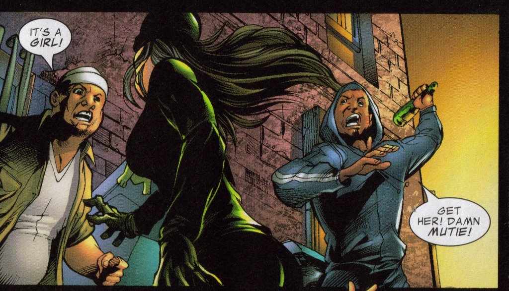
It's a girl.
It's a girl!?!
I see absolutely no reason for the bad guy to call attention to his opponent's gender. I mean, this is the Marvel Universe, home of Black Cat, Black Widow, Elektra, Psylocke, Misty Knight, Colleen Wing, Echo, Spider-Woman, and numerous others. Is it really that surprising anymore when the black clad warrior with the glowing talisman who is kicking your ass turns out to be female?
I can see establishing a villain's personality as sexist, but I really don't see what that adds to the story in this case. Maybe my standards are just set too high because it's disappointing that fight scenes still get interrupted to point out the gender of the participants. It tore me out of the story for a few minutes. I much prefer a world where women kicking ass was accepted as natural and not something worth commenting but I suppose that's too much escapism for even comic books.
Of course, it's possible that I am completely overreacting and that I never would have noticed this if I wasn't already irritated to be reading something drawn by such a terrible artist. Good art covers a multitude of sins. There just wasn't any good art nearby to soothe my easily inflamed and oversensitive temper.
Aside from that were a few scenes that seemed a bit too long (but could have been saved by a better artist), and some character issues. Black Widow just seemed "off," not at all like herself. It took me until her name was said to realize it was Natasha, and in Marvel Comics she should be distinctive immediately. The Spanglish was cliche. I still don't feel comfortable enough calling White Tiger by her first name, so I think more could have been done to make the character personable, but this is just the first issue by a writer who's never written before. It could be turned around later.
On the whole, I would grade it as "Better than Judd Winick and Tom Raney."


0 Yorumlar